The Center for Spiritual formation, an organization that offers spiritual retreats, contacted me to design an online invitation to an event, Dreaming of a New Eden. They had hosted the event in Florida in 2023 and were hosting one in Pennsylvania in 2024. They supplied me with last year’s invitation.


It was a great design. A light green background with wavy, darker green sections formed the structure of the page. Three brightly colored native flowers adorned the light green sections. Ghosts of the flower graphics textured all three light sections. The headlines were the same script font as the logo and the body text was an all caps font with small serifs. A pro had designed this invitation.
The only thing I might have changed was the all caps body text. In general, I don’t like all caps. It’s not as readable as upper/lowercase. Plus, in texting and emailing, all caps is considered screaming at the reader.
As much as I wanted to come up with my own totally different design, I decided to go with a design similar to last year’s invitation mainly because the client stated that the design had worked well for them last year.
The design process
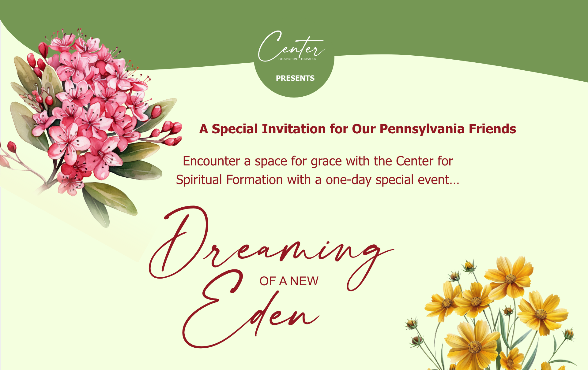
First thing I did was find some flowers native to Pennsylvania. The first flower was the Pennsylvania state flower, the mountain laurel. I found three more brightly colored native flowers. All four were hyperrealistic AI generated flowers that went well together.
I then worked up three similar versions of the invitation.


The first one was almost identical to the Florida version with four brightly colored flowers, ghosted texture in the background and the wavy green sections. The second version I designed with straight background sections, five flowers and cleaned up heading/body text. For the third version I went back to the wavy sections, keeping the flowers as designed in the second version. The wavy sections aligned more with the script headings and the organic shapes of the flowers.
The client’s reaction
The client made several small tweaks like increasing the size of the text. She felt that the text over the ghosting was almost unreadable. She really liked the flower grouping at the bottom of the second and third versions. As did I, she leaned toward the third version layout.
As of this post I have been waiting three days for final approval. It’s frustrating to wait.
Epilogue
After a week of waiting and no communication, the director finally contacted me. It turns out the reason for the wait was she broke her ankle. This is a fitting reminder that sometimes a frustrating wait has nothing to do with me or my skills as a graphics designer.