
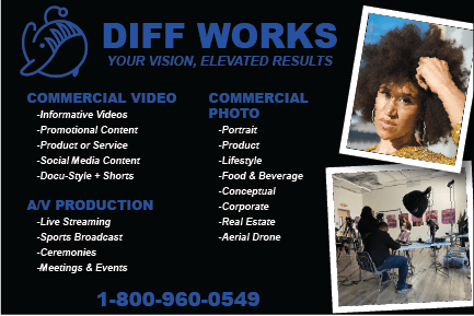
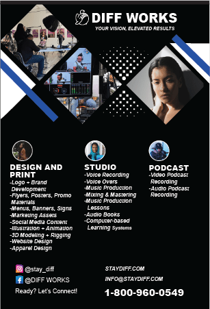
I should have noticed several services the client was offering: – logo and brand development, – flyers, posters, promo materials, -menus, banners, signs and -marketing assets. It should have been a red flag that a company offering the same services that I offer would want to hire a Fiverr freelancer.
The client gave me a list of 35 services they wanted divided over the front and back of a double-sided 4” x 6” printed card. This card needed to stylistically align with their web page.
First Challenge

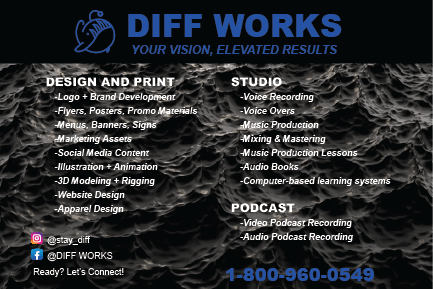
The first challenge was significant. Their web page (pictured above) was primarily black with electric blue highlights. I had read that sometimes the RGB (web) colors were different than CMYK (print) colors. I didn’t realize that this was especially true for the highly saturated colors. The most saturated, high-contrast blue in RGB translated to a deep, muddy, low-contrast purple in CYMK. I played around with the blues for way too much time and finally decided the best choice was a blue named neon blue (pictured below) which was not even close to the RGB saturated blue.
Delivery #1

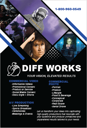
I submitted my design for the card. The client dismissed it outright. The problem was not the color. They wanted a much more dynamic design and sent three sample examples. I shouldn’t have been surprised. They had sent me a whole Dropbox full of photos and I had used only three.
I reoriented, cropped, extended the background of, changed the frames of and put together a montage that was similar to their example layout. This time I used most of the photos in their Dropbox.
Delivery #2

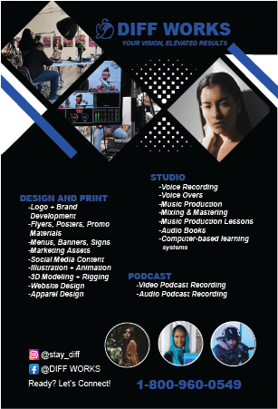
The client liked the design. However, they wanted the lists to have a better hierarchy in their sectioning. They suggested that three portrait examples in round frames that I had put at the bottom of the page be used to head the sections.
Delivery #3
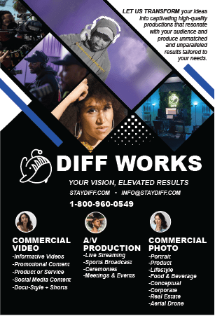
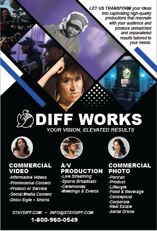
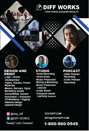
We were getting close to a final copy. The client wanted minor changes to the text and layout. Can you find nine differences?
Delivery #4
Delivered and accepted.
Final Thoughts
As I tuck my tail between my legs, I admit that the final copy is much better than my original. The client spent a lot of time and thought instructing me in how to make the design more dynamic, something the client shouldn’t have to do. I gained a lot of knowledge under their tutelage. I learned that a lot of elements can fit on a 4″ x 6″ card. I learned that saturated colors don’t translate to print. I learned how to make a design dynamic using strategically cropped and framed photos, design elements adding a splash of color and background textures. I learned how to make well delineated sections with a good hierarchy and attention getting elements.
So what do I do when the client knows more than me? I swallow my pride and learn.