About Tado
We’re a new startup that helps people deliver gifts to others for their birthdays and other special occasions. Via our app, people can select a gift from a wide selection of gifts that changes every week. They put in their payment details and their friend’s address information and we at Tado handle the packing and shipping. Customers can also personalize it using birthday cards and personalized tags.
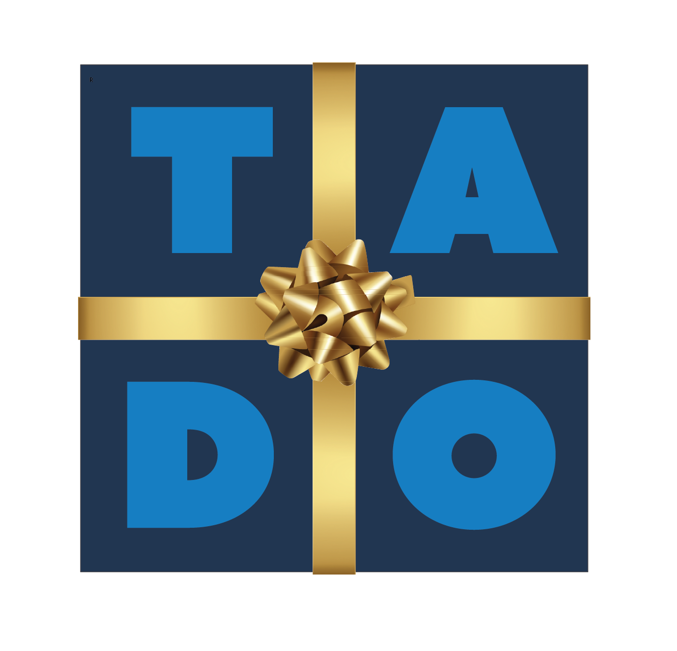
About the Logo
What better way to represent a gift giving service than with a gift! This logo works well at both large and small scales. The deep blue of the package conveys power, depth, and elegance. The letters of the company, TADO rendered using the blocky Azo Sans Uber Regular font in a medium blue, decorate the front of the package. The medium blue is often associated with calmness, stability and intuition. The whole package is neatly tied up with a shiny gold bow, the gold denoting the generosity and compassion of gift giving.
My Thoughts
I loved how this logo came together. I had already downloaded the font for another project so I didn’t have to search for the perfect font. The ribbons and bow were a bit tricky to render as the clip art was flawed but when it came together it made the package shine. While the blues are often considered a masculine power color the bow softened that connotation. The blues seemed to complement the gold like no other color. All in all, it was a fun and satisfying project.